Framing is a very powerful tool in level design. In addition to presenting an appealing view, the way a level designer frames a space can control what information gets presented to the player (and, as importantly, what is obscured from the player) which assist in making a decision. It is important to apply good framing techniques not just to static elements that are contained within a level (such as landmarks or signs) but also combat. I’d like to take a look at how “Lies of P”, developed by Neowiz Games and Round8 studio and released in 2023, frames it’s combat encounters early on in the game, in the first two hours. The way the designers framed their engagements is used to:
- teach the player enemy behaviour
- prioritize targets
- introduce the player to ambushes and a sense of “danger around the corner”
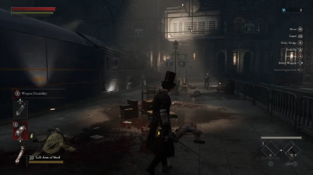
The first example I’d like to take a look at occurs right at the beginning of the game. Once player exits the starting train area and steps out on to the platform, the player is presented with the first two combat encounters. The very first enemy the player sees is some distance away from the player, allowing the player to observe:
- what an enemy looks like
- how it moves
- what sort of weapon it holds
- the distance at which it detects the player and what it does after
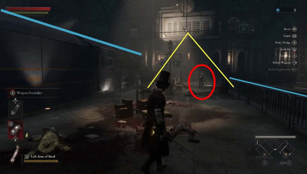
Leading lines, light and directionality are all used in framing this first important encounter. Leading lines are pointing towards the enemy, while the light placed above creates a bright spot and attracts the player’s eye. The enemy is also placed slightly to the right of the player, allowing a clear line of sight, especially since the player has to move from the left towards the right side of the screen, accross the platform. The enemy is also placed almost directly on the main path, acting as a sort of “gatekeeper” to progression. There is a lot of hidden learning going on here and it is assisted by how well the enemy is presented.
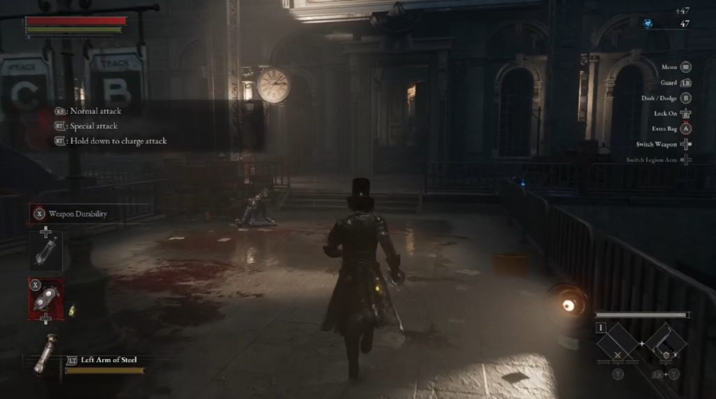
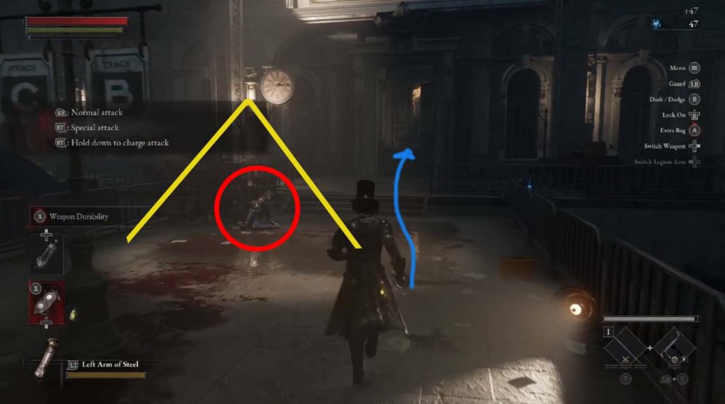
After dispatching the first enemy, the second one the player sees is laying on the ground . It is triggered by the approaching player, teaching that while some enemies will always be active in the level (enemy 1) others will be triggered by the player’s proximity to them(enemy 2). This enemy, however, is not placed directly on the main path so if the player runs past it and triggers it this will act as one of the first (of many) elements of surprise.
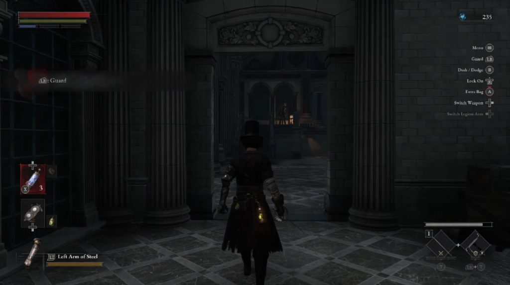
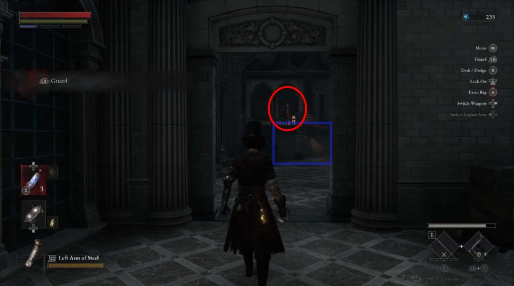
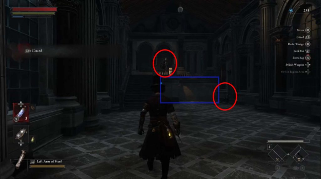
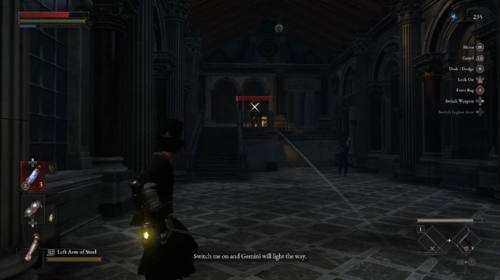
The next example I’d like to look at is the first time the player encounters a ranged enemy. It is framed centrally, through the doorway (which is a great framing device) and is elevated above ground, indicating importance. The light placed behind it attracts the eye but also creates a kind of silhouette of the enemy, perhaps adding more mystery. As the player steps into the space the second enemy is revealed, laying in the far corner. This positioning of the enemies, and their type (melee & ranged) splits the player’s attention and teaches an important still for the rest of the game; prioritization. The player is presented with the choice of running past the melee enemy to deal with the more threatening ranged AI, or dance around the bullets and dispatch the melee enemy first. The framing of the space, however, encourages the player to fight for the high ground first and deal with the rifleman before turning attention to the slower melee enemy on the ground below.
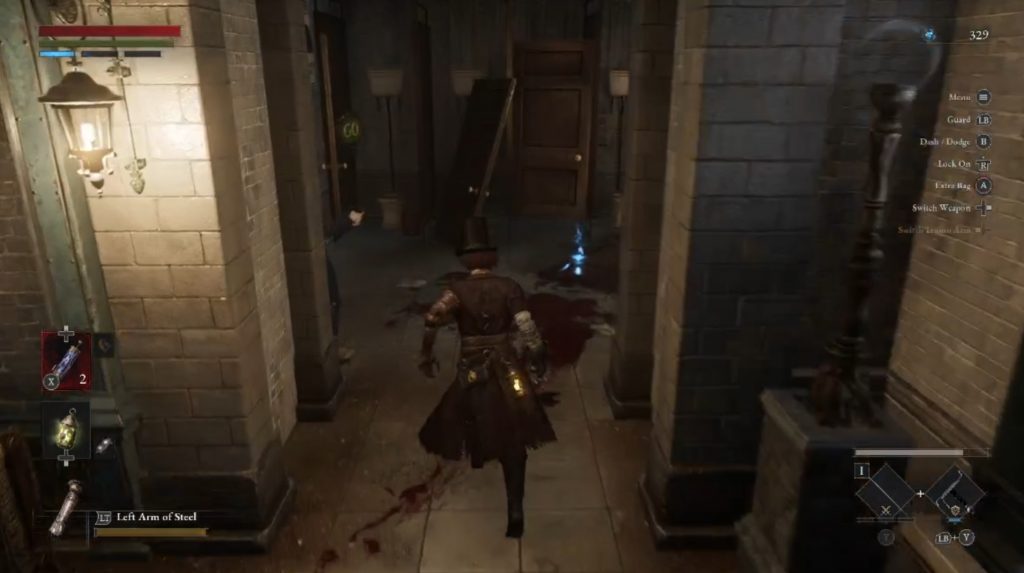
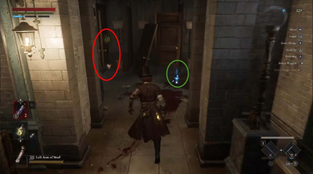
An ambush is an important element of a Souls-like game and Lies of P teaches one early on, but in a fairly safe manner. The player sees a small dead end room with an item further in. The enemy in this case is not present in front of the player, as we’ve seen in previous examples. Rather, the enemy is mostly obscured (which presents less information for the player), but enough is still revealed that the player might catch on to this being an ambush. The enemy’s arm is visible behind the doorframe, with is traffic sign weapon well in the player’s view. The game is not without it’s humour: the sign, of course, says “Go”. And, of course, seeing a pool of blood on the ground might tip the player off that something is wrong. This will be the safest ambush the player sees; from now on, they will get more deadly.
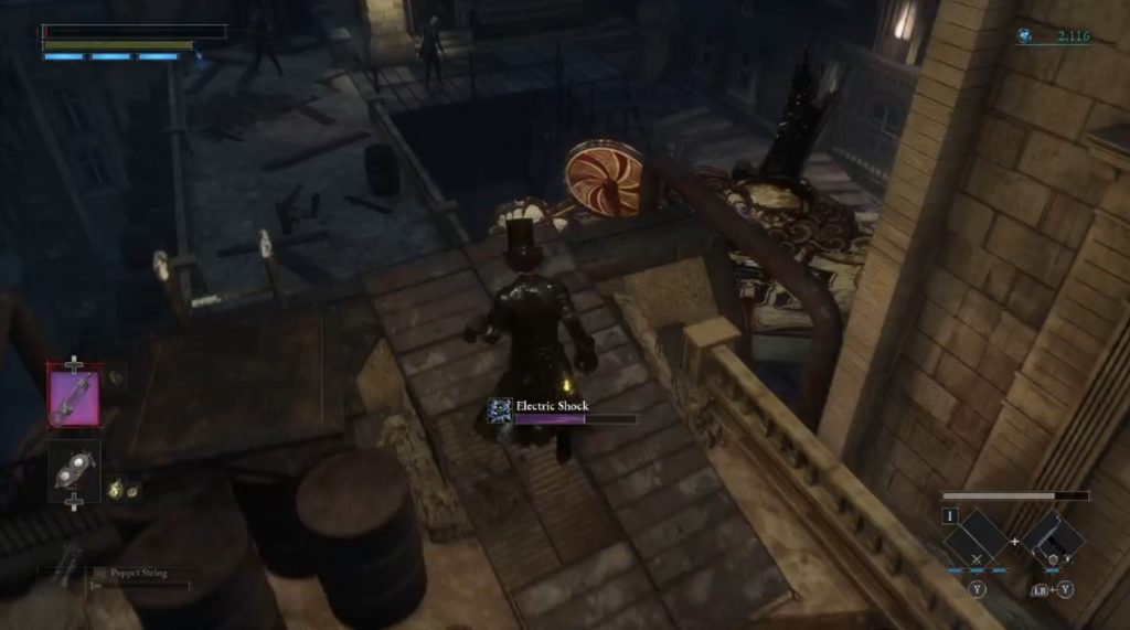
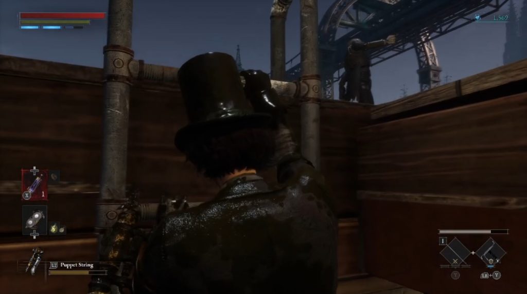
All of these framing mechanism are used to teach the player how to read the space and the enemy encounters within them. These setups get reinforced throughout the game, particularly in one really fun section of the first full level, around the 1.5 hr mark, where all of the devices discussed above come together really well. The player is on the rooftops now (with added danger of falling off and is presented with this framing:
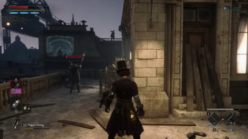
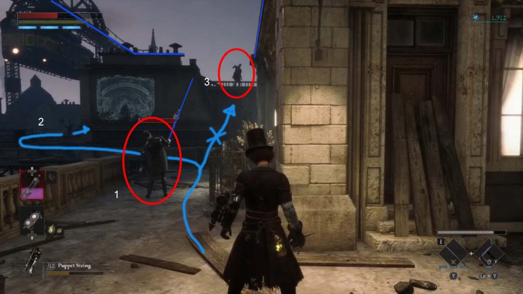
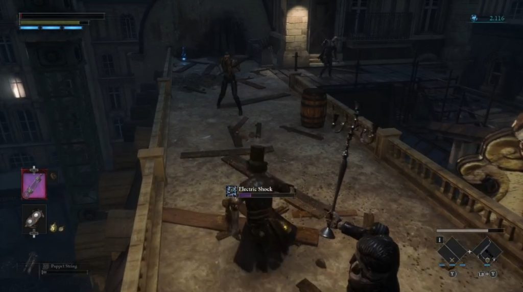
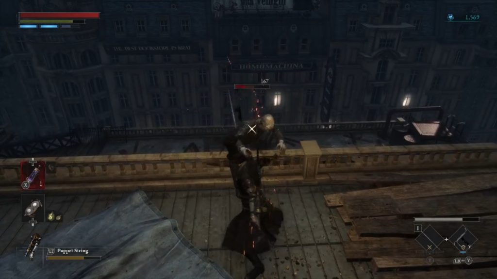
There is a ranged enemy framed above the player, on high ground, it’s silhouette looming menacingly over the entire space. For the duration of this encounter it will throw shock bombs at the player and will become the player’s “nemesis”. The first enemy in this space, directly in front of is, “points” towards the eventual nemesis above. It is facing away from the player, tricking them into entering the space and performing a backstab (or to encourage the use of the Puppet String arm mod). But be careful; as soon as the player enters the bomb thrower’s line of sight, the rain of shock will start. The enemy above the player is inaccessible; the narrow pathway to the left seems like the way to go. It turns around the corner and houses yet another melee enemy clearly visible and facing the player. The enemies are static until the player enters the engagement space. And throughout this entire encounter, the shock bomber above continually throws the bombs at the player, forcing them to never drop pace.
After getting past the first few enemies and avoiding the shock bombs, the player now has the high ground, which brings with it a sense of confidence. Generally, anything framed from the high ground gives a sense of an advantage, being elevated higher than the subject. However, this is where the level throws in a surprise; as soon as the player jumps down towards the next couple of enemies, the player gets ambushed from behind.
The next beat involves a reveal of the ladder that the player would need to take to reach the “shock bomb nemesis” but guarding it is a single charging enemy. The enemy is framed through an opening (very similarly to the first ranged enemy the player encountered ), which makes the player focus solely on the enemy and its movement. The encounter space becomes more narrow, limiting the player’s navigation and amplifying the danger of the charge, since there isn’t too much space to dodge away from it.
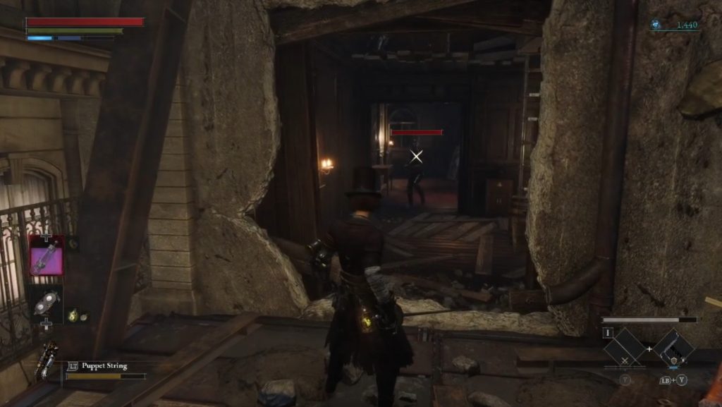
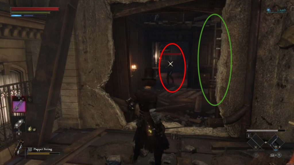
However, even this enemy proves to be no match from the player and after climbing the ladder, the player can finally exact revenge on the “shock bomber nemesis”!
Framing is an important tool when designing 3D levels with combat encounters. Through the use of leading lines, openings, elevation and lighting, level designers have a great toolset to present and stage a single encounter or a group of enemies. Sometimes what the player does not see is as important as what the player sees. And successful framing of a space can tell the player a world of information without a single word or written text.